StayArc - Simplifying Multi-Property Management
- May 18
- 6 min read
Updated: 4 days ago
Property operators managing listings across Airbnb, Booking.com, and VRBO were spending too much time switching between platforms just to handle everyday operations. From reservations and guest stays to cleaning schedules, owner blocks, and operational tasks, the workload quickly became fragmented and difficult to manage.
As the Lead Product / UX Designer, I led the design of StayArc from early product strategy through V1 launch, shaping a unified platform that helped operators manage everything in one place.

From founder sketches and early ideas to a launch-ready product, I helped shape the first version of StayArc through research, feature prioritisation, UX strategy, and iterative design.
Role | Lead Product / UX Designer |
Duration | 4 Months (V1 Launch) |
Users | 15+ Early Users in First 40 Days |
Scope | B2B SaaS / Multi-Property Operations |
The Problem
Managing multiple platforms means managing multiple problems.

Managing short-term rentals across multiple booking platforms created more operational complexity than most teams could realistically handle.
Property operators were constantly switching between Airbnb, Booking.com, and VRBO just to manage bookings, block dates, update availability, coordinate cleaning, and handle day-to-day operations.
This created a chain reaction of problems:
|
|
|
|
|
Several early users described reducing the number of platforms they used simply because managing everything across multiple systems became too difficult.
“We stopped using some platforms because managing everything became too chaotic.”
The issue wasn’t a lack of tools, it was cognitive overload caused by fragmented workflows.
My Role
As the Lead Product / UX Designer, I worked closely with founders and developers to shape StayArc from an early concept into a launch-ready V1 product.

My role covered both product thinking and design execution, including:
competitor analysis across platforms such as Guesty, Hostaway, and Smoobu
user research through usertesting platform and direct conversations with property operators
defining V1 scope while balancing user needs, business priorities, and technical feasibility
mapping user journeys and operational workflows
collaborating with developers throughout implementation and handoff
creating wireframes, design systems, and interactive prototypes
Rather than designing in isolation, the process involved constant iteration between product ideas, user feedback, and technical constraints to ensure what we built was both useful and practical.
Discovery & Research

Before defining the first version of StayArc, I focused on understanding how property operators were currently managing bookings and day-to-day operations across multiple platforms.
This included competitor analysis across tools such as Guesty, Hostaway, and Smoobu, user testing research, and direct conversations with 12–15 short-term rental operators.
A key pattern became clear early.
Many users were not full-time hospitality operators. Short-term rentals were often an additional income stream alongside their regular work, which meant they had little time or patience to learn multiple complex systems.
The common frustrations were consistent:
constantly switching between Airbnb, Booking.com, and VRBO to complete basic tasks
manually blocking dates to avoid double bookings
operational pressure coordinating cleaners, guest support, and owner availability
steep learning curves across existing platforms
low visibility across properties, bookings, and operational activity
This shaped an important product direction:
The goal wasn’t to build another feature-heavy property tool. It was to reduce friction and make multi-property management easier to understand and act on.
Shaping the MVP Strategy
One of the biggest early decisions was resisting the temptation to build everything at once.
The short-term rental space already includes feature-heavy platforms, but research showed that complexity was part of the problem, not the solution.
Instead of trying to replicate every advanced capability from day one, we focused on the workflows users needed most to manage properties with less friction.
This meant prioritising a lean but practical first version centred around:
centralised booking visibility across multiple platforms
availability management to reduce double-booking risk
operational task coordination for property teams
owner scheduling and property blocking
clearer navigation across day-to-day workflows
More advanced capabilities including deeper automation, AI-assisted actions, and expanded operational tooling were intentionally considered as future phases rather than forcing unnecessary complexity into the first release.
This helped us move faster, validate the product earlier, and create a foundation that could evolve based on real user behaviour.
Information Architecture & Core Flows
A key design challenge was turning fragmented property workflows into a product that felt simple to navigate and easy to act on.
Instead of forcing users to think in terms of separate booking platforms, the experience was structured around how they actually manage their operations day to day.
The first version focused on a clear product structure across the core areas users relied on most:
|
|
|
|
|
|
|
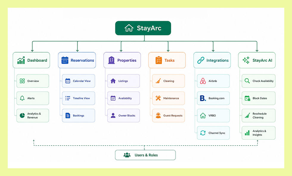
The goal was to reduce context switching and create a central operating experience where users could manage bookings, availability, tasks, and property activity without jumping between disconnected systems.
A typical user journey looked like this:
Connect booking platforms → view unified reservations → manage availability → coordinate property tasks → update operations from one place
Design around user workflows, not platform architecture.
Rethinking Reservation Visibility
One of the biggest usability challenges appeared in how reservations were being viewed and managed.
Early exploration relied heavily on a timeline-based view, which worked in theory but became difficult in practice especially for busy operators managing multiple properties.
As bookings increased, the experience required excessive horizontal scrolling, making it harder to compare reservations, identify overlaps, and act quickly.
Users had to mentally piece together availability patterns rather than recognising them instantly.
To improve this, I introduced a calendar-based reservation view alongside the existing timeline option, allowing users to choose the format that worked best for them.


This made it much easier to:
spot booking overlaps at a glance
understand occupancy across daily, weekly, and monthly views
make faster scheduling decisions
reduce unnecessary cognitive effort
Users familiar with competing tools like Smoobu responded particularly well to this approach, describing the experience as significantly easier to manage.
Make critical information easy to recognise, not harder to reconstruct.

Before
excessive scroll
difficult overlap detection
fragmented visibility

After
weekly
monthly visibility
easier scanning
Final Product Experience
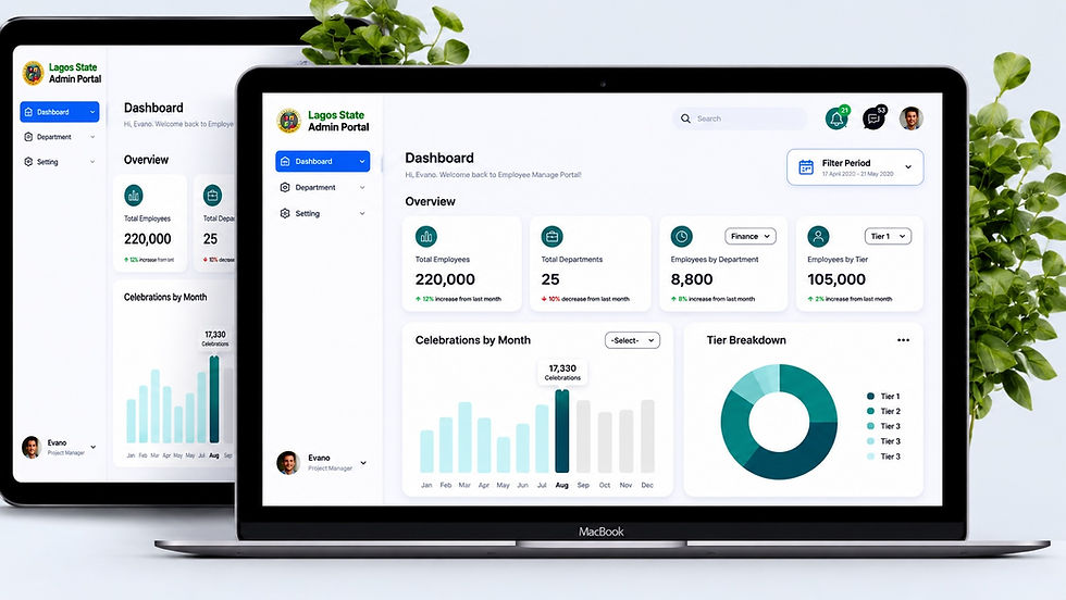
Unified Operational Dashboard
The dashboard was designed to give operators immediate visibility into what mattered most without forcing them to navigate multiple disconnected tools.
Bookings, reservations, operational activity, and property status were brought into one central view to reduce friction and support faster decision-making.

2. Reservation Management
Instead of checking each booking platform individually, users could manage reservations through a unified operational workflow designed around speed and clarity.
This reduced platform switching and made daily booking management significantly easier.

3. Calendar Experience
The reservation experience was expanded with calendar-based visibility, allowing users to scan occupancy, overlaps, and scheduling activity in a way that matched how they naturally plan operations.
Timeline views remained available for users already comfortable with that workflow.
4. Property & Task Management
Managing short-term rentals involves more than reservations.
Property tasks, cleaning coordination, operational updates, and owner availability needed to be manageable from the same ecosystem, reducing fragmented day-to-day workflows.


5. Integrations
The experience began with platform integration, allowing StayArc to function as a central operational layer rather than another disconnected tool.
This helped operators manage Airbnb, Booking.com, and VRBO workflows from a single environment.

AI-Assisted Property Management
As the platform evolved, we explored how AI could reduce operational effort even further by allowing users to interact with property management workflows conversationally.
Instead of navigating through multiple sections manually, operators could use StayArc AI to quickly perform actions, retrieve information, and manage day-to-day operations through natural language interactions.

The assistant was designed around practical operational scenarios such as:
|
|
|
|
|
The goal was not to replace the product experience, but to reduce friction for busy operators who needed faster ways to manage routine operational tasks.
Reduce operational effort by bringing actions closer to user intent.
Product Outcomes

Outcomes
Following multiple design iterations and collaborative development cycles, StayArc launched successfully and received strong early feedback from users managing short-term rental operations across multiple platforms.
The first version gained early adoption within the first few weeks of launch, validating the need for a more unified operational experience in the short-term rental space.
The product continues to evolve, with ongoing improvements and future versions focused on expanding operational capabilities while maintaining usability and clarity.

Reflection
One of the biggest lessons from this project was understanding that good product design is often about removing complexity rather than adding more features.
It’s easy to keep introducing new functionality, but operational products become harder to use when every possible feature competes for attention.
This project reinforced the importance of designing around real user behaviour, prioritising clarity, and focusing on the workflows users rely on most instead of overwhelming them with unnecessary complexity.
“Products should be shaped around how users actually work, not around how many features can be added.”


Comments